Hey, Maya’s here. In this tutorial, I’ll teach you how to develop your own slider block.
First, we’ll use the @wordpress/create-block script to generate a starter dynamic block. Then, we’ll add the required settings by adding the necessary WordPress components. Finally, we’ll render the slider using PHP code.
Table of Contents
Develop your own Slider Block
To create our slider block, we’ll be using the swiffy-slider library. This library is super light and very easy to use. Of course, you’re free to choose any JavaScript library you prefer for creating your slider.
You can download the final version of the slider block plugin from here, install it on your website, and give it a test.
After installing the WPCookie Image Slider plugin, you’ll find its icon in the editor.
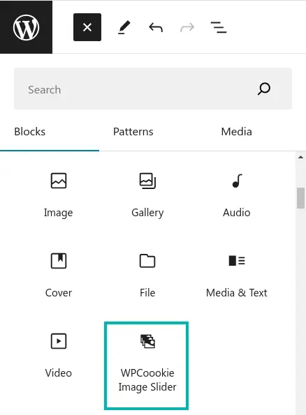
With this block, you have the freedom to add as many images as you’d like to your slider.
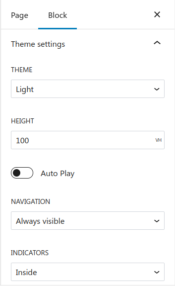
In the Block Settings section, we’ve included two additional parts to allow users to customize their slider settings: the General section and the Theme Settings section. During this post you will learn how to add these settings to your block.
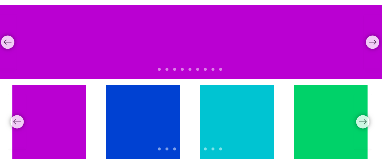
You can use this block to make a slider or carousel.
Pre-requisites
Before following this tutorial, make sure you have the following pre-requisites.
- Node.js and npm: Node.js is a JavaScript runtime that allows you to run JavaScript on the server-side.
- WordPress Environment: You’ll need a local WordPress development environment set up on your machine. This can be achieved using tools like XAMPP, MAMP, or Local by Flywheel.
- React and JSX: React is a JavaScript library for building user interfaces. Gutenberg blocks are built using React, so you’ll need to have some understanding of React concepts and its syntax, including JSX (JavaScript XML), which is an extension to JavaScript used in React for creating reusable UI components.
- PHP and CSS
Let’s dive into the code!
Open your terminal and run the following command.
npx @wordpress/create-block@latest wpcookie-image-slider --variant=dynamicAfter executing this command, you’ll find a new directory named wpcookie-image-slider . This directory contains all the initial files needed to start customizing your block. Copy this folder in the plugins folder.
Navigate to the Plugins page in the WordPress admin and confirm that the plugin is active. Then, create a new page or post and ensure you can insert the WPCookie Image Slider.
Reviewing the files
Before we begin modifying the block, it’s important to review the plugin’s file structure.
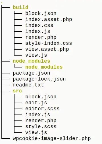
Throughout the block development process in WordPress, we’ll primarily be focusing on the src folder, which holds the essential files and components needed to build and customize your block.
Our slider block consists of three main files:
render.php: This file contains the PHP code that renders the front-end output of the slider.block.json: This file defines the block metadata, including attributes, icons, and other settings.edit.js: This file contains the JavaScript code for the block editor interface, allowing users to customize the slider settings.
Before proceeding to the following steps, run npm run start in the terminal from within the plugin directory. This command will watch each file in the /src folder for changes. The block’s build files will be updated each time you save a file.
block.json
Open the block.json file in the /src folder. It requires some updating to suit the needs of the Image Slider Block.
This file defines the block metadata, including its attributes, icon, description, and other settings. It also specifies the block dependencies, like the front-end and editor scripts and styles.
block.json complete code
{
  "$schema": "https://schemas.wp.org/trunk/block.json",
  "apiVersion": 3,
  "name": "wpcookie/wpcookie-image-slider",
  "version": "0.1.0",
  "title": "WPCoookie Image Slider",
  "category": "media",
  "attributes": {
    "images": {
      "type": "array",
      "default": []
    },
    "autoPlay": {
      "type": "boolean",
      "default": true
    },
    "pauseOnHover": {
      "type": "boolean",
      "default": true
    },
    "showCaption": {
      "type": "boolean",
      "default": true
    },
    "imageSize": {
      "type": "string",
      "default": "full",
      "enum": [
        "thumbnail",
        "medium",
        "full"
      ]
    },
    "layout": {
      "type": "string",
      "default": "slider-item-show slider-item-noga",
      "enum": [
        "slider-item-showe slider-item-nogap",
        "slider-item-show2",
        "slider-item-show3",
        "slider-item-show4",
        "slider-item-show5",
        "slider-item-show6"
      ]
    },
    "navigation": {
      "type": "string",
      "default": "slider-nav-visible",
      "enum": [
        "slider-nav-visible",
        ""
      ]
    },
    "indicators": {
      "type": "string",
      "default": "",
      "enum": [
        "",
        "slider-indicators-outside"
      ]
    },
    "theme": {
      "type": "string",
      "default": "",
      "enum": [
        "",
        "slider-indicators-dark slider-nav-dark"
      ]
    },
    "height": {
      "type": "string",
      "default": "100vh"
    },
    "align": {
      "type": "string",
      "default": ""
    }
  },
  "icon": "images-alt",
  "description": "Create slick looking image slider and carousel.",
  "example": {},
  "supports": {
    "html": false
  },
  "textdomain": "wpcookie-image-slider",
  "editorScript": "file:./index.js",
  "editorStyle": "file:./index.css",
  "style": "file:./style-index.css",
  "render": "file:./render.php",
  "viewScript": [
    "file:./view.js",
    "file:./assets/swiffy-slider.min.js"
  ]
}
Here’s a breakdown of the key parts:
"name": "wpcookie/wpcookie-image-slider",This is the unique name of the block, following the namespace/block-name convention. It’s used to identify and register the block within the WordPress ecosystem.
"title": "WPCoookie Image Slider",This is the human-readable title of the block that will be displayed in the block inserter and other places within the WordPress admin area.
"category": "media",This line specifies the category under which the block will be listed in the block inserter. In this case, it’s the “media” category.
"attributes": { ... },This section defines the block’s attributes, which represent the data and settings that the block can store and manage. Each attribute has a type (e.g., array, boolean, string), a default value, and potentially an enum of allowed values.
"icon": "images-alt",This line specifies the Dashicon (WordPress icon) that will represent the block in the block inserter and other places within the WordPress admin area.
"description": "Create slick looking image slider and carousel.",This is a brief description of the block’s functionality, which can be displayed in the block inserter or other contexts.
"editorScript": "file:./index.js",
  "editorStyle": "file:./index.css",
  "style": "file:./style-index.css",
These lines specify the paths to the JavaScript and CSS files that define the block’s editor interface and front-end styles, respectively.
"render": "file:./render.php",This line specifies the path to the PHP file responsible for rendering the block’s output on the front-end.
"viewScript": [
    "file:./view.js",
    "file:./assets/swiffy-slider.min.js"
  ]
This section lists the JavaScript files that should be loaded on the front-end when the block is rendered. In this case, it includes a custom view.js file and a third-party library, swiffy-slider.min.js.
By understanding each line in the block.json file, you can better grasp how the block is configured, registered, and managed within the WordPress ecosystem. This file serves as the central configuration point for your Gutenberg block, defining its behavior, appearance, and dependencies.
edit.js
This file contains the JavaScript code that powers the block editor interface.
edit.js complete code
/**
* edit.js complete code by WPCookie
*
* @see https://developer.wordpress.org/block-editor/reference-guides/packages/packages-i18n/
*/
import { __ } from "@wordpress/i18n";
/**
* React hook that is used to mark the block wrapper element.
* It provides all the necessary props like the class name.
*
* @see https://developer.wordpress.org/block-editor/reference-guides/packages/packages-block-editor/#useblockprops
*/
import {
useBlockProps,
MediaPlaceholder,
MediaUpload,
MediaUploadCheck,
BlockIcon,
BlockControls,
InspectorControls,
AlignmentToolbar,
} from "@wordpress/block-editor";
import {
ToolbarButton,
ToolbarGroup,
ToggleControl,
PanelBody,
SelectControl,
__experimentalUnitControl as UnitControl,
} from "@wordpress/components";
/**
* Lets webpack process CSS, SASS or SCSS files referenced in JavaScript files.
* Those files can contain any CSS code that gets applied to the editor.
*
* @see https://www.npmjs.com/package/@wordpress/scripts#using-css
*/
import "./editor.scss";
/**
* The edit function describes the structure of your block in the context of the
* editor. This represents what the editor will render when the block is used.
*
* @see https://developer.wordpress.org/block-editor/reference-guides/block-api/block-edit-save/#edit
*
* @return {Element} Element to render.
*/
export default function Edit(props) {
const hasImages = props.attributes.images.length > 0;
return (
<>
<InspectorControls>
<PanelBody title={__("General", "wpcookie-image-slider")} initialOpen>
<SelectControl
value={props.attributes.imageSize}
options={[
{ value: "thumbnail", label: "Thumbnail" },
{ value: "medium", label: "Medium" },
{ value: "full", label: "Full" },
]}
label={__("Image Size", "wpcookie-image-slider")}
onChange={(newimageSize) =>
props.setAttributes({ imageSize: newimageSize })
}
/>
<SelectControl
value={props.attributes.layout}
options={[
{ value: "slider-item-nogap", label: "1 slide per page" },
{ value: "slider-item-show2", label: "2 slide per page" },
{ value: "slider-item-show3", label: "3 slide per page" },
{ value: "slider-item-show4", label: "4 slide per page" },
{ value: "slider-item-show5", label: "5 slide per page" },
{ value: "slider-item-show6", label: "6 slide per page" },
]}
label={__("Layout", "wpcookie-image-slider")}
onChange={(newlayout) => props.setAttributes({ layout: newlayout })}
/>
<ToggleControl
checked={props.attributes.showCaption}
label={__("Show Caption", "wpcookie-image-slider")}
onChange={() =>
props.setAttributes({
showCaption: !props.attributes.showCaption,
})
}
/>
</PanelBody>
<PanelBody
title={__("Theme settings", "wpcookie-image-slider")}
initialOpen={false}
>
<SelectControl
value={props.attributes.theme}
options={[
{ value: "", label: "Light" },
{
value: "slider-indicators-dark slider-nav-dark",
label: "Dark",
},
]}
label={__("Theme", "wpcookie-image-slider")}
onChange={(newtheme) => props.setAttributes({ theme: newtheme })}
/>
<UnitControl
label="Height"
value={ props.attributes.height || "" }
onChange={ ( newHeight ) => props.setAttributes({ height: newHeight }) }
units={ [
{ value: 'px', label: 'px' },
{ value: '%', label: '%' },
{ value: 'em', label: 'em' },
{ value: 'vh', label: 'vh', default: true },
] }
/>
<ToggleControl
checked={props.attributes.autoPlay}
label={__("Auto Play", "wpcookie-image-slider")}
onChange={() =>
props.setAttributes({
autoPlay: !props.attributes.autoPlay,
})
}
/>
{props.attributes.autoPlay && (
<ToggleControl
checked={props.attributes.pauseOnHover}
label={__("Pause on hover", "wpcookie-image-slider")}
onChange={() =>
props.setAttributes({
pauseOnHover: !props.attributes.pauseOnHover,
})
}
/>
)}
<SelectControl
value={props.attributes.navigation}
options={[
{ value: "slider-nav-visible", label: "Always visible" },
{ value: "", label: "Auto hide" },
]}
label={__("Navigation", "wpcookie-image-slider")}
onChange={(newnavigation) =>
props.setAttributes({ navigation: newnavigation })
}
/>
<SelectControl
value={props.attributes.indicators}
options={[
{ value: "", label: "Inside" },
{ value: "slider-indicators-outside", label: "Outside" },
]}
label={__("Indicators", "wpcookie-image-slider")}
onChange={(newindicators) =>
props.setAttributes({ indicators: newindicators })
}
/>
</PanelBody>
</InspectorControls>
<div {...useBlockProps()}>
<BlockControls>
<ToolbarGroup>
<MediaUploadCheck>
<MediaUpload
multiple
gallery
addToGallery={true}
onSelect={(newImages) =>
props.setAttributes({ images: newImages })
}
allowedTypes={["image"]}
value={props.attributes.images.map((image) => image.id)}
render={({ open }) => (
<ToolbarButton onClick={open}>
{__("Edit Gallery", "wpcookie-image-slider")}
</ToolbarButton>
)}
/>
</MediaUploadCheck>
<AlignmentToolbar
value={ props.attributes.align }
onChange={ ( newAlign ) =>
props.setAttributes({ align: newAlign })
}
alignmentControls={ [
{
icon: 'align-none',
title: 'None',
align: '',
},
{
icon: 'align-wide',
title: 'Wide Width',
align: 'alignwide',
},
{
icon: 'align-full-width',
title: 'Full Width',
align: 'alignfull',
},
] }
/>
</ToolbarGroup>
</BlockControls>
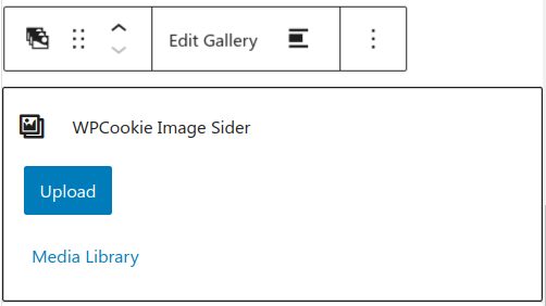
{hasImages && (
<figure className="wpcookie-image-slider-inner-container">
{props.attributes.images.map((image, index) => (
<img key={index} src={image.url} />
))}
</figure>
)}
{!hasImages && (
<MediaPlaceholder
multiple
gallery
icon={<BlockIcon icon="format-gallery" />}
labels={{
title: "WPCookie Image Sider",
instructions: "Create an awesome image slider.",
}}
onSelect={(newImages) => props.setAttributes({ images: newImages })}
/>
)}
</div>
</>
);
}The edit.js file contains the JavaScript code that powers the block editor interface, allowing users to customize the slider settings and preview the changes. Here’s a breakdown of the WordPress components used in this file:
import {
  useBlockProps,
  MediaPlaceholder,
  MediaUpload,
  MediaUploadCheck,
  BlockIcon,
  BlockControls,
  InspectorControls,
  AlignmentToolbar,
} from "@wordpress/block-editor";

import {
  ToolbarButton,
  ToolbarGroup,
  ToggleControl,
  PanelBody,
  SelectControl,
  __experimentalUnitControl as UnitControl,
} from "@wordpress/components";- ToolbarButton: The
ToolbarButtoncomponent is used to create custom buttons that can be added to the block toolbar. In this case, it’s used to create the “Edit Gallery” button, which opens the media uploader and allows users to add or edit images for the slider. - ToolbarGroup: The
ToolbarGroupcomponent is used to group related toolbar buttons and controls together. In this code, it’s used to group the “Edit Gallery” button and the alignment toolbar controls. - ToggleControl: The
ToggleControlcomponent renders a toggle switch that allows users to enable or disable a particular setting. In this block, it’s used for settings like “Show Caption”, “Auto Play”, and “Pause on Hover”. - PanelBody: The
PanelBodycomponent is used to create collapsible panels within the block inspector controls. In this code, it’s used to group related settings under “General” and “Theme settings” panels. - SelectControl: The
SelectControlcomponent renders a dropdown or select input, allowing users to choose from a list of options. In this block, it’s used for settings like “Image Size”, “Layout”, “Theme”, “Navigation”, and “Indicators”. - __experimentalUnitControl: The
UnitControlcomponent (prefixed with__experimentalat the time of writing) allows users to input a value with a unit (e.g.,100px,50%,2em). In this block, it’s used to set the height of the slider.
The export default function Edit(props) function is the main component that renders the block editor interface. Let’s break it down:
This is a function component in React, which is the standard way of defining components in modern React code.
The function is named Edit, which is a convention for the component that renders the block editor interface. It takes a props argument, which contains various properties and data related to the block instance
const hasImages = props.attributes.images.length > 0;This line defines a constant variable hasImages, which is a boolean value indicating whether the block has any images or not. It checks the length of the images array in the block’s attributes object, which is part of the props.
return (
  <>
    {/* Block editor interface components */}
  </>
);
This is the main return statement of the component, where the UI for the block editor interface is rendered. The <> and </> syntax is a React fragment, which allows you to return multiple elements without a parent container element.
Inside the fragment, you’ll find various components and JSX elements that make up the block editor interface. These include:
InspectorControls: This component renders the block settings panel on the right side of the editor.PanelBody: These are collapsible sections within theInspectorControls, grouping related settings together.SelectControl,ToggleControl,UnitControl: These are input components that allow users to customize the block settings.BlockControls: This component renders the toolbar controls above the block instance.ToolbarGroup: This groups related toolbar controls together.MediaUpload,MediaUploadCheck: These components handle the media upload functionality for adding images to the slider.AlignmentToolbar: This component provides alignment controls for the block.useBlockProps: This React hook provides the necessary props for the main block wrapper element, including class names and other attributes.- Conditional rendering: Depending on the value of
hasImages, the component will either render the images or display aMediaPlaceholderprompting the user to upload images.
render.php
The render.php file is responsible for rendering the front-end output of the image slider block. In other words, it generates the HTML code that displays the slider on your website’s pages or posts.
render.php complete code
<?php
/**
 * @see https://github.com/WordPress/gutenberg/blob/trunk/docs/reference-guides/block-api/block-metadata.md#render
 */
?>

<div class="<?= $attributes["align"] ?> swiffy-slider slider-nav-round slider-nav-sm slider-item-show2-sm slider-indicators-round <?=$attributes["theme"] ?> <?=$attributes["indicators"] ?> <?=$attributes["navigation"] ?> <?=$attributes["layout"] ?> <?php if ($attributes["autoPlay"] == true)
{
    echo "slider-nav-autoplay";
    if ($attributes["pauseOnHover"] == true)
    {
        echo " slider-nav-autopause";
    }
} ?>">

 <ul class="slider-container">

	<?php

	$cover_class = ( $attributes["align"] == "alignfull" ) ? ["class" => "cover_class"] : "";


$i = 1;
foreach ($attributes["images"] as $image)
{
    echo '<li><div id="slide' . $i . '" class="wpcookie-slide-parent">
		<div class="wpcookie-slide" style="max-height: ' . $attributes["height"] . '; ">
		';
    $id = $image["id"];
    $caption = end($image);

    echo wp_get_attachment_image($id, $attributes["imageSize"], "", $cover_class);
    if ($attributes["showCaption"] == true && is_string($caption) && strlen($caption) > 1)
    {
        echo "<p class='wpcookie-slider-caption'>" . $caption . "</p>";
    }

    echo '</div></div></li>';
    $i++;
}

?>
	 </ul>
	    <button type="button" class="slider-nav"></button>
    <button type="button" class="slider-nav slider-nav-next"></button>

	<ul class="slider-indicators"> <?php
foreach ($attributes["images"] as $image)
{ ?>

        <li class=""></li>

	<?php
} ?>

    </ul>

</div>
Let’s go through the code step by step:
<div class="<?= $attributes["align"] ?> swiffy-slider ...">This line creates a <div> element, which will be the main container for the slider. The classes applied to this container include:
<?= $attributes["align"] ?>: This class is based on the alignment setting you choose in the block editor (e.g., left, center, wide, or full-width).swiffy-slider: This is the main class for the Swiffy Slider library we’re using to create the slider functionality.- Other classes like
slider-nav-round,slider-nav-sm,slider-item-show2-sm,slider-indicators-round,<?=$attributes["theme"] ?>,<?=$attributes["indicators"] ?>,<?=$attributes["navigation"] ?>, and<?=$attributes["layout"] ?>: These classes are also related to the styling and behavior of the slider based on the settings you choose in the block editor.
Inside this main container, we have the following:
<ul class="slider-container">
    <?php
    $i = 1;
    foreach ($attributes["images"] as $image) {
        // Loop through each image and generate the HTML
    }
    ?>
</ul>
This is an unordered list (<ul>) with the class slider-container. It’s where we’ll put the actual slides (images) of the slider.
Inside the loop, we generate an <li> element for each image:
<li>
    <div id="slide<?= $i ?>" class="wpcookie-slide-parent">
        <div class="wpcookie-slide" style="max-height: <?= $attributes["height"] ?>;">
            <?= wp_get_attachment_image($id, $attributes["imageSize"], "", $cover_class); ?>
            <?php if ($attributes["showCaption"] == true && is_string($caption) && strlen($caption) > 1) { ?>
                <p class="wpcookie-slider-caption"><?= $caption ?></p>
            <?php } ?>
        </div>
    </div>
</li>- The
<div>with the classwpcookie-slide-parentis a container for each slide. - Inside it, we have another
<div>with the classwpcookie-slide, which has amax-heightstyle set based on theheightsetting you chose in the block editor. - We use the
wp_get_attachment_imagefunction to render the actual image, with the size ($attributes["imageSize"]) and alignment ($cover_class) based on the block settings. - If the
showCaptionsetting is enabled and the image has a caption, we display it inside a<p>element with the classwpcookie-slider-caption.
After the loop, we have the navigation buttons and pagination indicators:
<button type="button" class="slider-nav"></button>
<button type="button" class="slider-nav slider-nav-next"></button>
<ul class="slider-indicators">
    <?php foreach ($attributes["images"] as $image) { ?>
        <li class=""></li>
    <?php } ?>
</ul>- The
<button>elements with the classslider-navandslider-nav-nextare the previous and next navigation buttons for the slider. - The unordered list (
<ul>) with the classslider-indicatorscontains the pagination indicators (dots) for the slider. We generate one<li>element for each image in the slider.
This PHP code generates the HTML structure for the image slider based on the settings and images provided through the block editor interface. When rendered on the front-end, it will display a fully functional and styled image slider using the Swiffy Slider library.
Adding JavaScript and CSS files
Adding JavaScript File
In the src folder, create a new folder called assets and copy the swiffy-slider.min.js file into it. We have already introduced this file in block.json as a part of the viewScript property:
"viewScript": [
    "file:./view.js",
    "file:./assets/swiffy-slider.min.js"
]
This ensures that the swiffy-slider.min.js file will be loaded on the front-end when the block is rendered.
Adding CSS Styles
In the style.scss file, we need to include the styles provided by the Swiffy Slider library. You can paste the contents of the swiffy-slider.min.css file at the end of style.scss file, after our own style.
style.scss complete code
div.wpcookie-slide-parent {
    height: 100%;
}
div.wpcookie-slide {
    max-height: 100vh;
    overflow: hidden;
    position: relative;
    display: flex;
    justify-content: center;
    align-items: stretch;
    height: 100%;
}
.wpcookie-slide img {
    object-fit: contain;
    width: 100%;
}
p.wpcookie-slider-caption {
    font-weight: bold;
    font-size: 1.8em;
    color: black;
    background-color: #ffffff4d;
    padding: 10px 19px;
    border-radius: 5px;
    position: absolute;
    left: 50%;
    top: 50%;
    transform: translate(-50%, -50%);
}
button.slider-nav:hover, button.slider-nav:focus {
    background: #ffffff00;
}
.entry-content ul, .entry-content ol {
    padding: 0!important;
}
img.cover_class {
    object-fit: cover!important;
}
.swiffy-slider {
    direction: ltr;
}

.swiffy-slider{position:relative;display:block;width:100%;--swiffy-slider-snap-align:center;--swiffy-slider-item-width:100%;--swiffy-slider-item-gap:1rem;--swiffy-slider-item-reveal:0rem;--swiffy-slider-item-ratio:2/1;--swiffy-slider-item-count:1;--swiffy-slider-nav-light:#fff;--swiffy-slider-nav-dark:#333;--swiffy-slider-nav-zoom:1;--swiffy-slider-track-opacity:0.1;--swiffy-slider-track-height:0;--swiffy-slider-nav-outside-size:3.5rem;--swiffy-slider-indicator-outside-size:1.5rem;--swiffy-slider-animation-duration:.75s;--swiffy-slider-animation-delay:0s;--swiffy-slider-animation-timing:ease-in-out}.swiffy-slider,.swiffy-slider::after,.swiffy-slider::before{box-sizing:border-box}.swiffy-slider ::-webkit-scrollbar{height:var(--swiffy-slider-track-height)}.swiffy-slider ::-webkit-scrollbar-track{background:rgba(0,0,0,var(--swiffy-slider-track-opacity))}.swiffy-slider ::-webkit-scrollbar-thumb{background:rgba(0,0,0,.4);border-radius:1rem}.swiffy-slider ::-webkit-scrollbar-thumb:hover{background:rgba(0,0,0,.6)}.slider-container{--swiffy-slider-item-gap-totalwidth:calc(var(--swiffy-slider-item-gap) * (var(--swiffy-slider-item-count) - 1));--swiffy-slider-item-width:calc((100% - var(--swiffy-slider-item-reveal) - var(--swiffy-slider-item-gap-totalwidth)) / var(--swiffy-slider-item-count));overflow-x:auto;-webkit-overflow-scrolling:touch;-ms-scroll-snap-type:x mandatory;scroll-snap-type:x mandatory;scroll-behavior:smooth;display:grid;align-items:center;height:100%;grid:auto/auto-flow -webkit-max-content;grid:auto/auto-flow max-content;grid-auto-rows:100%;grid-auto-columns:var(--swiffy-slider-item-width);grid-auto-flow:column;grid-gap:var(--swiffy-slider-item-gap);list-style:none;margin:0;padding:0;scrollbar-width:none;scrollbar-color:rgba(0,0,0,.4) rgba(0,0,0,var(--swiffy-slider-track-opacity));background-clip:padding-box}.slider-container>*{scroll-snap-align:var(--swiffy-slider-snap-align);position:relative;width:100%;height:100%}.slider-item-helper .slider-container>*{background-size:cover;background-color:#e1e1e1;background-position:50% 50%;display:flex;justify-content:center;align-items:center}.slider-item-helper:not(.slider-item-ratio) .slider-container>*{min-height:20rem}.slider-item-ratio .slider-container>*>*{position:absolute;top:0;left:0;width:100%;height:100%;-o-object-fit:cover;object-fit:cover}.slider-item-ratio-contain .slider-container>*>*{-o-object-fit:contain;object-fit:contain}.slider-item-ratio .slider-container>::after{display:block;padding-top:calc(100% / (var(--swiffy-slider-item-ratio)));content:""}.slider-item-ratio-32x9{--swiffy-slider-item-ratio:32/9}.slider-item-ratio-21x9{--swiffy-slider-item-ratio:21/9}.slider-item-ratio-16x9{--swiffy-slider-item-ratio:16/9}.slider-item-ratio-4x3{--swiffy-slider-item-ratio:4/3}.slider-item-ratio-2x1{--swiffy-slider-item-ratio:2/1}.slider-item-ratio-1x1{--swiffy-slider-item-ratio:1/1}.slider-item-ratio-3x4{--swiffy-slider-item-ratio:3/4}.slider-nav-scrollbar{--swiffy-slider-track-height:0.5rem}.slider-nav-scrollbar .slider-container{scrollbar-width:thin}.slider-nav-nodelay .slider-container{scroll-behavior:auto}.slider-indicators{position:absolute;right:2rem;bottom:0;left:2rem;display:flex;justify-content:center;padding:0;margin-bottom:1rem;list-style:none}.slider-nav-scrollbar .slider-indicators{margin-bottom:calc(1rem + var(--swiffy-slider-track-height))}.slider-indicators>.active{opacity:1}.swiffy-slider.slider-indicators-outside .slider-nav{margin-bottom:var(--swiffy-slider-indicator-outside-size)}.swiffy-slider.slider-indicators-outside{padding-bottom:var(--swiffy-slider-indicator-outside-size)}.swiffy-slider.slider-indicators-outside .slider-indicators,.swiffy-slider.slider-indicators-outside.slider-indicators{margin-bottom:0}.slider-indicators>*{box-sizing:content-box;flex:0 1 auto;width:2rem;height:.2rem;padding:0;border:.4rem solid transparent;cursor:pointer;background-color:#fff;background-clip:padding-box;opacity:.5;transition:opacity .4s ease}.slider-indicators-square .slider-indicators>*,.slider-indicators-square.slider-indicators>*{width:.5rem;height:.5rem;border:.4rem solid transparent}.slider-indicators-round .slider-indicators>*,.slider-indicators-round.slider-indicators>*{width:.5rem;height:.5rem;border:.4rem solid transparent;border-radius:50%}.slider-indicators-highlight .slider-indicators>.active,.slider-indicators-highlight.slider-indicators>.active{border:.33rem solid transparent;padding:.07rem}.slider-nav{position:absolute;top:0;left:0;bottom:0;border:0;background-color:transparent;cursor:pointer;padding:0;visibility:hidden;opacity:.8;transition:visibility .1s,opacity .2s linear;margin-bottom:var(--swiffy-slider-track-height);display:flex;align-items:center;padding:0 .5rem;-webkit-filter:drop-shadow(0 0 .5rem rgba(0, 0, 0, .5));filter:drop-shadow(0 0 .5rem rgba(0, 0, 0, .5));transform:scale(var(--swiffy-slider-nav-zoom))}.slider-nav::before{position:absolute;content:"";padding:.5rem;width:3rem;height:3rem}.slider-nav::after{content:"";-webkit-mask:url("data:image/svg+xml,<svg xmlns='http://www.w3.org/2000/svg' fill='%23fff' viewBox='0 0 16 16'><path fill-rule='evenodd' d='M11.354 1.646a.5.5 0 0 1 0 .708L5.707 8l5.647 5.646a.5.5 0 0 1-.708.708l-6-6a.5.5 0 0 1 0-.708l6-6a.5.5 0 0 1 .708 0z'></path></svg>");mask:url("data:image/svg+xml,<svg xmlns='http://www.w3.org/2000/svg' fill='%23fff' viewBox='0 0 16 16'><path fill-rule='evenodd' d='M11.354 1.646a.5.5 0 0 1 0 .708L5.707 8l5.647 5.646a.5.5 0 0 1-.708.708l-6-6a.5.5 0 0 1 0-.708l6-6a.5.5 0 0 1 .708 0z'></path></svg>");-webkit-mask-size:cover;mask-size:cover;background-color:var(--swiffy-slider-nav-light);background-origin:content-box;width:3rem;height:3rem}.slider-nav-arrow .slider-nav::after{-webkit-mask:url("data:image/svg+xml,<svg xmlns='http://www.w3.org/2000/svg' fill='%23fff' viewBox='0 0 16 16'><path fill-rule='evenodd' d='M12 8a.5.5 0 0 1-.5.5H5.707l2.147 2.146a.5.5 0 0 1-.708.708l-3-3a.5.5 0 0 1 0-.708l3-3a.5.5 0 1 1 .708.708L5.707 7.5H11.5a.5.5 0 0 1 .5.5z'></path></svg>");mask:url("data:image/svg+xml,<svg xmlns='http://www.w3.org/2000/svg' fill='%23fff' viewBox='0 0 16 16'><path fill-rule='evenodd' d='M12 8a.5.5 0 0 1-.5.5H5.707l2.147 2.146a.5.5 0 0 1-.708.708l-3-3a.5.5 0 0 1 0-.708l3-3a.5.5 0 1 1 .708.708L5.707 7.5H11.5a.5.5 0 0 1 .5.5z'></path></svg>")}.slider-nav-chevron .slider-nav::after{-webkit-mask:url("data:image/svg+xml,<svg xmlns='http://www.w3.org/2000/svg' fill='%23fff' viewBox='0 0 16 16'><path fill-rule='evenodd' d='M9.224 1.553a.5.5 0 0 1 .223.67L6.56 8l2.888 5.776a.5.5 0 1 1-.894.448l-3-6a.5.5 0 0 1 0-.448l3-6a.5.5 0 0 1 .67-.223z'></path></svg>");mask:url("data:image/svg+xml,<svg xmlns='http://www.w3.org/2000/svg' fill='%23fff' viewBox='0 0 16 16'><path fill-rule='evenodd' d='M9.224 1.553a.5.5 0 0 1 .223.67L6.56 8l2.888 5.776a.5.5 0 1 1-.894.448l-3-6a.5.5 0 0 1 0-.448l3-6a.5.5 0 0 1 .67-.223z'></path></svg>")}.slider-nav-caret .slider-nav::after{-webkit-mask:url("data:image/svg+xml,<svg xmlns='http://www.w3.org/2000/svg' fill='%23fff' viewBox='0 0 16 16'><path d='M10 12.796V3.204L4.519 8 10 12.796zm-.659.753-5.48-4.796a1 1 0 0 1 0-1.506l5.48-4.796A1 1 0 0 1 11 3.204v9.592a1 1 0 0 1-1.659.753z'></path></svg>");mask:url("data:image/svg+xml,<svg xmlns='http://www.w3.org/2000/svg' fill='%23fff' viewBox='0 0 16 16'><path d='M10 12.796V3.204L4.519 8 10 12.796zm-.659.753-5.48-4.796a1 1 0 0 1 0-1.506l5.48-4.796A1 1 0 0 1 11 3.204v9.592a1 1 0 0 1-1.659.753z'></path></svg>")}.slider-nav-caretfill .slider-nav::after{-webkit-mask:url("data:image/svg+xml,<svg xmlns='http://www.w3.org/2000/svg' fill='%23fff' viewBox='0 0 16 16'><path d='m3.86 8.753 5.482 4.796c.646.566 1.658.106 1.658-.753V3.204a1 1 0 0 0-1.659-.753l-5.48 4.796a1 1 0 0 0 0 1.506z'></path></svg>");mask:url("data:image/svg+xml,<svg xmlns='http://www.w3.org/2000/svg' fill='%23fff' viewBox='0 0 16 16'><path d='m3.86 8.753 5.482 4.796c.646.566 1.658.106 1.658-.753V3.204a1 1 0 0 0-1.659-.753l-5.48 4.796a1 1 0 0 0 0 1.506z'></path></svg>")}.swiffy-slider:hover .slider-nav{visibility:visible}.swiffy-slider.slider-nav-autohide.slider-item-first-visible .slider-nav:not(.slider-nav-next){visibility:hidden}.swiffy-slider.slider-nav-autohide.slider-item-last-visible .slider-nav.slider-nav-next{visibility:hidden}.slider-nav-outside .slider-container{margin:0 var(--swiffy-slider-nav-outside-size)}.slider-nav-outside .slider-nav{padding:0}.swiffy-slider .slider-nav:hover{opacity:1}.slider-nav-square .slider-nav{padding:0}.slider-nav-round .slider-nav::before,.slider-nav-square .slider-nav::before{background-color:var(--swiffy-slider-nav-light)}.slider-nav-round .slider-nav::after,.slider-nav-square .slider-nav::after{background-color:var(--swiffy-slider-nav-dark);width:2rem;height:2rem;margin:.5rem}.slider-nav-round .slider-nav::before{border-radius:50%}.slider-nav-round .slider-nav::after{-webkit-mask:url("data:image/svg+xml,%3Csvg xmlns='http://www.w3.org/2000/svg' viewBox='0 0 16 16' %3E%3Cpath fill-rule='evenodd' d='M15 8a.5.5 0 0 0-.5-.5H2.707l3.147-3.146a.5.5 0 1 0-.708-.708l-4 4a.5.5 0 0 0 0 .708l4 4a.5.5 0 0 0 .708-.708L2.707 8.5H14.5A.5.5 0 0 0 15 8z'%3E%3C/path%3E%3C/svg%3E");mask:url("data:image/svg+xml,%3Csvg xmlns='http://www.w3.org/2000/svg' viewBox='0 0 16 16' %3E%3Cpath fill-rule='evenodd' d='M15 8a.5.5 0 0 0-.5-.5H2.707l3.147-3.146a.5.5 0 1 0-.708-.708l-4 4a.5.5 0 0 0 0 .708l4 4a.5.5 0 0 0 .708-.708L2.707 8.5H14.5A.5.5 0 0 0 15 8z'%3E%3C/path%3E%3C/svg%3E")}.slider-nav-dark .slider-nav::after{background-color:var(--swiffy-slider-nav-dark)}.slider-nav-dark.slider-nav-round .slider-nav::before,.slider-nav-dark.slider-nav-square .slider-nav::before{background-color:var(--swiffy-slider-nav-dark)}.slider-nav-dark.slider-nav-round .slider-nav::after,.slider-nav-dark.slider-nav-square .slider-nav::after{background-color:var(--swiffy-slider-nav-light)}.slider-nav-sm{--swiffy-slider-nav-zoom:.75;--swiffy-slider-nav-outside-size:2.5rem}.slider-nav.slider-nav-next::after{transform:rotate(180deg)}.slider-nav.slider-nav-next{right:0;left:unset}.slider-nav-visible .slider-nav{visibility:visible}.slider-nav-dark .slider-nav{opacity:.6}.slider-indicators-dark .slider-indicators>*,.slider-indicators-dark.slider-indicators>*{-webkit-filter:invert(1);filter:invert(1)}.slider-item-snapstart{--swiffy-slider-snap-align:start}.slider-item-nosnap{--swiffy-slider-snap-align:unset}.slider-item-nogap{--swiffy-slider-item-gap:0rem}.slider-item-reveal{--swiffy-slider-item-reveal:8rem}.slider-item-snapstart.slider-item-reveal{--swiffy-slider-item-reveal:4rem}.slider-item-show2{--swiffy-slider-item-count:2}.slider-item-show3{--swiffy-slider-item-count:3}.slider-item-show4{--swiffy-slider-item-count:4}.slider-item-show5{--swiffy-slider-item-count:5}.slider-item-show6{--swiffy-slider-item-count:6}.slider-nav-mousedrag .slider-container{cursor:-webkit-grab;cursor:grab}.slider-nav-mousedrag.dragging .slider-container{-ms-scroll-snap-type:unset;scroll-snap-type:unset;scroll-behavior:unset;-webkit-user-select:none;-moz-user-select:none;-ms-user-select:none;user-select:none}.slider-nav-mousedrag.dragging .slider-nav{visibility:hidden}@media (hover:hover){.slider-nav-mousedrag .slider-container::after{content:"";position:absolute;width:100%;height:100%}}@media (prefers-reduced-motion:no-preference){.slider-nav-animation.slider-nav-animation-fast{--swiffy-slider-animation-duration:.25s}.slider-nav-animation.slider-nav-animation-slow{--swiffy-slider-animation-duration:1.25s}.slider-nav-animation .slider-container>*>*{transition:opacity var(--swiffy-slider-animation-duration) var(--swiffy-slider-animation-timing),transform var(--swiffy-slider-animation-duration) var(--swiffy-slider-animation-timing);transition-delay:var(--swiffy-slider-animation-delay)}.slider-nav-animation .slider-container .slide-visible>*{transition:opacity var(--swiffy-slider-animation-duration) var(--swiffy-slider-animation-timing),transform var(--swiffy-slider-animation-duration) var(--swiffy-slider-animation-timing);transition-delay:var(--swiffy-slider-animation-delay)}.slider-nav-animation.slider-nav-animation-fadein .slider-container>*>*{opacity:.5}.slider-nav-animation.slider-nav-animation-scale .slider-container>*>*{transform:scale(.9)}.slider-nav-animation.slider-nav-animation-appear .slider-container>*>*{opacity:.3;transform:scale(.9)}.slider-nav-animation.slider-nav-animation-scaleup .slider-container>*>*{transform:scale(.25)}.slider-nav-animation.slider-nav-animation-zoomout .slider-container>*{overflow:hidden}.slider-nav-animation.slider-nav-animation-zoomout .slider-container>*>*{transform:scale(1.3)}.slider-nav-animation.slider-nav-animation-turn .slider-container>*>*{transform:rotateY(70deg)}.slider-nav-animation.slider-nav-animation-slideup .slider-container>*>*{transform:translateY(60%) scale(.99)}.slider-nav-animation.slider-nav-animation-slideup .slider-container{overflow-y:hidden}.slider-nav-animation .slider-container>.slide-visible>*{opacity:1;transform:none}}@media (min-width:62rem){.slider-item-show2:not(.slider-item-snapstart) .slider-container>*,.slider-item-show4:not(.slider-item-snapstart) .slider-container>*,.slider-item-show6:not(.slider-item-snapstart) .slider-container>*{scroll-snap-align:unset}.slider-item-show2:not(.slider-item-snapstart) .slider-container>::before,.slider-item-show4:not(.slider-item-snapstart) .slider-container>::before,.slider-item-show6:not(.slider-item-snapstart) .slider-container>::before{content:" ";display:block;position:absolute;left:calc((var(--swiffy-slider-item-gap)/2)*-1);top:0;width:1px;height:1px;scroll-snap-align:var(--swiffy-slider-snap-align)}.slider-nav-outside-expand .slider-nav{margin-left:-4rem}.slider-nav-outside-expand .slider-nav.slider-nav-next{margin-right:-4rem}.slider-nav-sm.slider-nav-outside-expand .slider-nav{margin-left:-3.5rem}.slider-nav-sm.slider-nav-outside-expand .slider-nav.slider-nav-next{margin-right:-3.5rem}.slider-indicators-sm.slider-indicators{display:none}}@media (max-width:62rem){.swiffy-slider{--swiffy-slider-track-height:0rem;--swiffy-slider-item-reveal:0rem;--swiffy-slider-item-count:1;--swiffy-slider-nav-zoom:.875}.swiffy-slider .slider-item-show2-sm{--swiffy-slider-item-count:2}.slider-item-reveal{--swiffy-slider-item-reveal:4rem}.slider-item-snapstart.slider-item-reveal{--swiffy-slider-item-reveal:2rem}.slider-item-show6 .slider-container{grid-auto-columns:calc(25% - (var(--swiffy-slider-item-gap)/ 4*3))}.slider-item-show6.slider-item-reveal .slider-container{grid-auto-columns:calc(25% - (var(--swiffy-slider-item-gap)/ 4*3) - .5rem)}.slider-item-show6.slider-item-reveal .slider-container>*{scroll-snap-align:unset}.slider-item-show6.slider-item-reveal .slider-container>::before{content:" ";display:block;position:absolute;left:calc((var(--swiffy-slider-item-gap)/2)*-1);top:0;width:1px;height:1px;scroll-snap-align:center}.slider-nav::after,.slider-nav::before{width:2rem;height:2rem;padding:.3rem}.slider-nav-round .slider-nav::after,.slider-nav-square .slider-nav::after{width:1.75rem;height:1.75rem;margin:.125rem}.slider-nav-outside .slider-container,.slider-nav-outside-expand .slider-container{margin:0 2rem}.slider-nav-outside-expand .slider-container{margin:0 var(--swiffy-slider-nav-outside-size)}.slider-nav-outside-expand .slider-nav{padding:0}.slider-indicators-round .slider-indicators>*,.slider-indicators-round.slider-indicators>*,.slider-indicators-square .slider-indicators>*,.slider-indicators-square.slider-indicators>*{width:.3rem;height:.3rem}.slider-indicators{margin-bottom:.5rem;display:none}.slider-nav-scrollbar .slider-indicators{margin-bottom:0}.slider-indicators>*{width:1rem;height:.125rem;border-width:.25rem}.slider-indicators-sm .slider-indicators,.slider-indicators-sm.slider-indicators{display:flex}}@media (max-width:48rem){.slider-item-show6 .slider-container{grid-auto-columns:calc(50% - (var(--swiffy-slider-item-gap)/ 2))}.slider-item-show6.slider-item-reveal .slider-container{grid-auto-columns:calc(50% - (var(--swiffy-slider-item-gap)/ 2) - 1.5rem)}}@media (hover:none){.swiffy-slider.slider-nav-touch .slider-nav{visibility:visible}.swiffy-slider:not(.slider-nav-touch).slider-nav-outside .slider-container,.swiffy-slider:not(.slider-nav-touch).slider-nav-outside-expand .slider-container{margin:0 0}.slider-item-nosnap-touch{--swiffy-slider-snap-align:unset}}
/*# sourceMappingURL=swiffy-slider.min.css.map */
In this tutorial, we’ve covered how to create a responsive image slider block for WordPress using the Gutenberg block editor. We’ve explored the code structure, including the render.php file for rendering the front-end output, the block.json file for defining the block metadata, and the edit.js file for building the block editor interface.
editor.scss complete code
.wpcookie-image-slider-inner-container  {
		display: flex;
		flex-direction: row;
		overflow-x: scroll;
		margin: 1px;
}

.wpcookie-image-slider-inner-container img {
	max-width: 210px;
	object-fit: cover;
}
If this article is difficult for you to read in text, you can watch the video version below.
References:
How to create a scrollable image gallery block for WordPress Gutenberg
Build your first block

Hello Maya,
Thanks a lot for this tutorial. I just test the plugin on a simple FSE Theme dans the render is messy.
Have you an idea?
Here is a screenrecording.
https://share.cleanshot.com/RK928GHN
Cheers
Hi Grégoire,
It looks like a simple styling issue. If you can provide the URL to this page, I’d be happy to take a look and help you fix it.
Cheers,
Maya
Hi Maya,
Thanks for your answer. I will fix it.
Cheers,
Grégoire